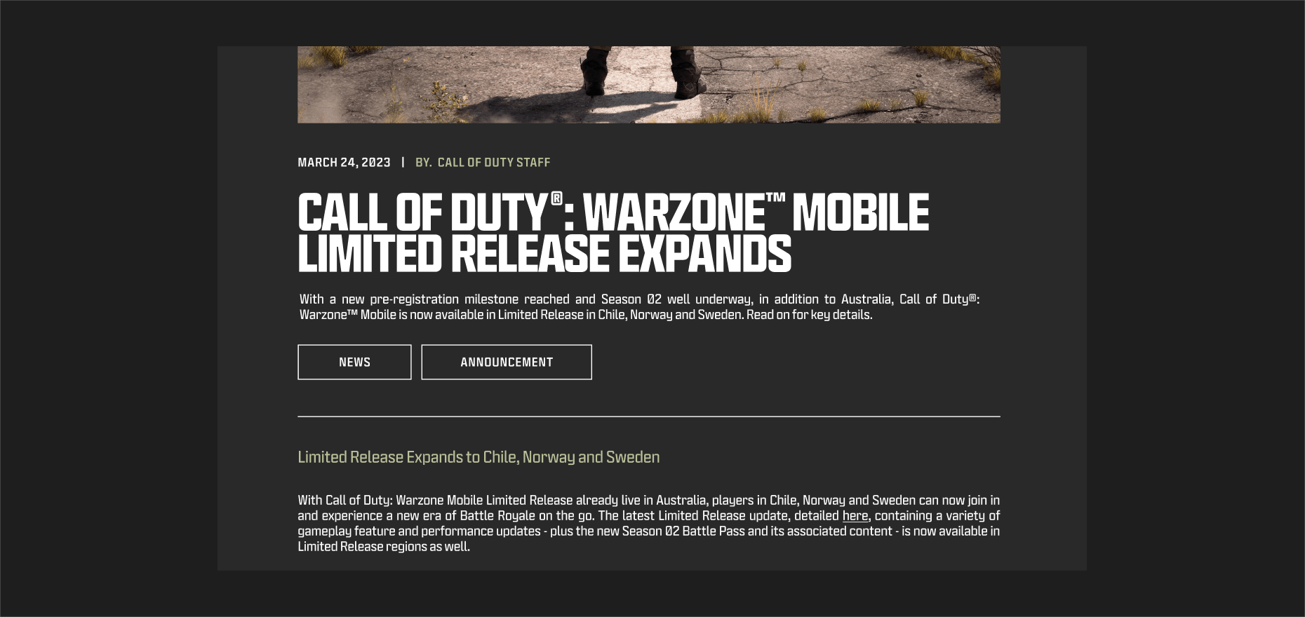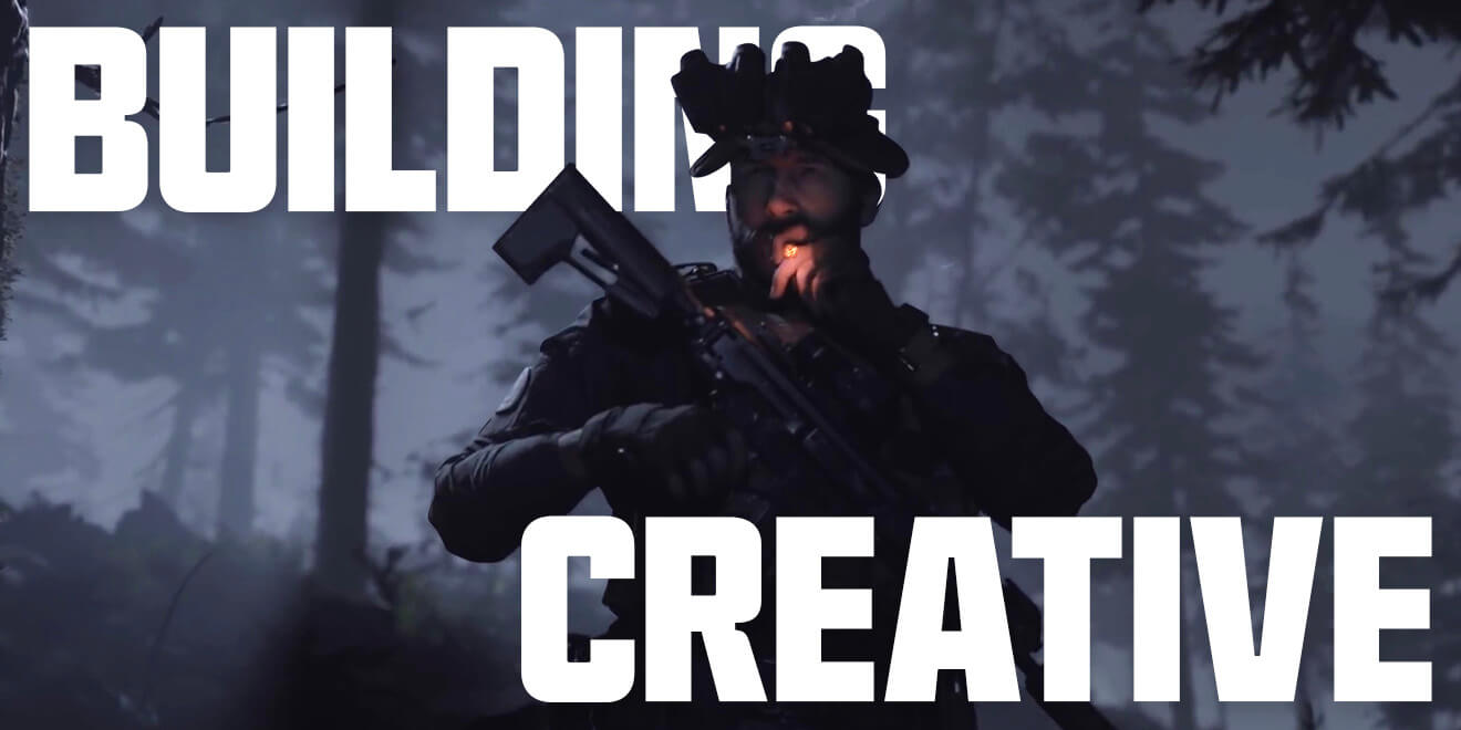
This section outlines some simple rules to use as guidance when creating assets using our new Hitmarker typeface. Assets used within this section are for reference only and act as inspiration and reference points for creating branded content.
This document is a starter guide to kick things off, the full franchise guidelines will contain much more depth in how exactly to build creative from start to finish.
The basics of building creative with our typeface follow five parts:
- Choose your canvas
- Set the margins
- Place and format the copy
- Position images
- Add final elements

THE CANVAS
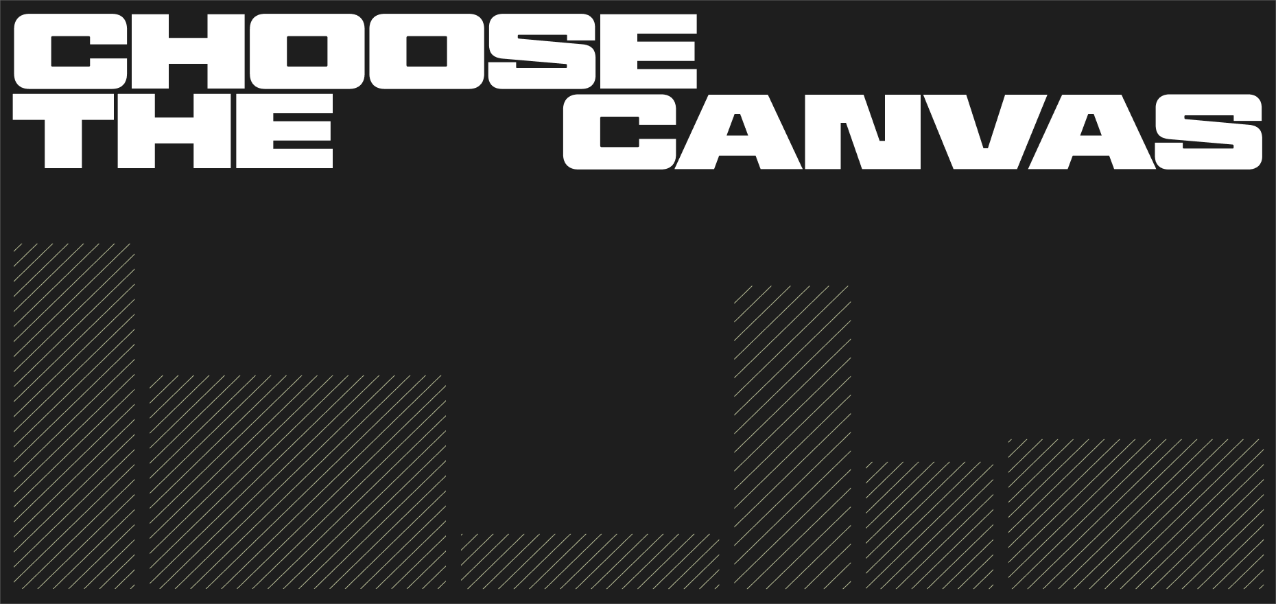
The first stage of setting typography within creative requires understanding the surface area we are designing to. This is our frame, it can be square, horizontal or vertical.

THE MARGINS
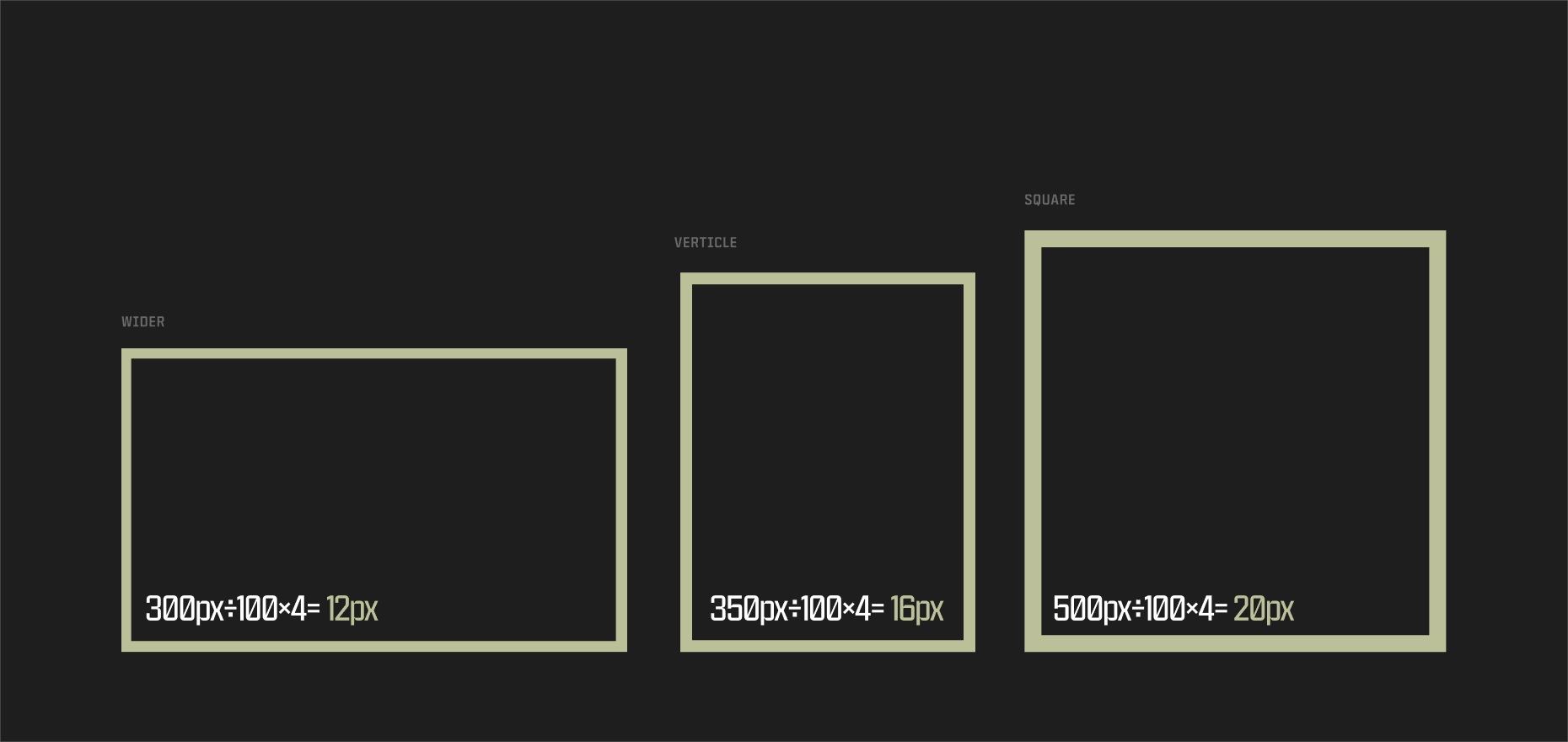
Once we have selected a frame size, we need to work out the margin that acts as a limit to where we place typography and other content. We have a simple rule where we aim to set the margin at 4% of the smallest side of the frame. This way we can create consistency across all of the different frame sizes we need to build to. Some frames may require wider margins depending on safe zones and printing requirements however.
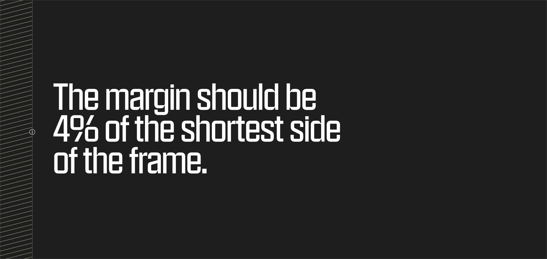
- The shortest side of the frame in this example is the distance between the top and the bottom.
In this example, the formula is applied to find the right size for the margin based on the sizing of the frame. Because this is a percentage based rule, in very small applications, we may need to optically align the margin to give enough spacing.
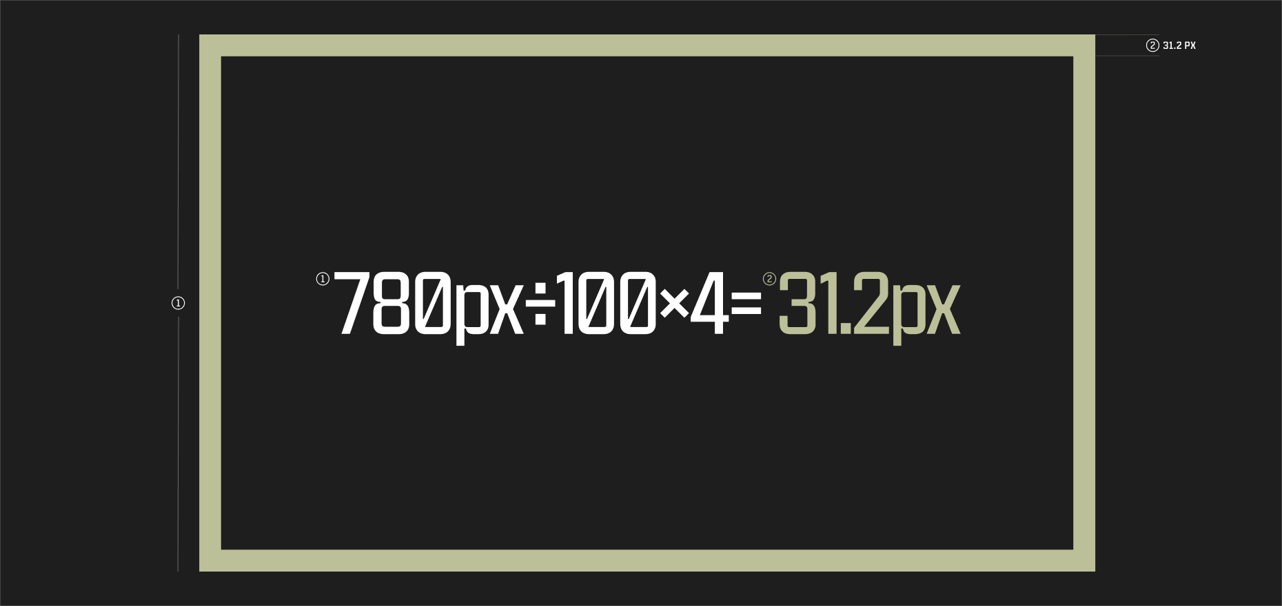
- The shortest side of the frame is 780px in height.
- 4% of the shortest frame height is 31.2px, the size of the margins.
Some further examples of how this formula is applied to different sizes and orientations of frame.

HEADLINE PLACEMENT
The third stage requires positioning headlines. Our typeface is rooted in a military aesthetic and we couple that with a blocky use of it within layout. Where possible, we try to align our headline copy with the margins of the frame and use line breaks to create impactful movement between words.
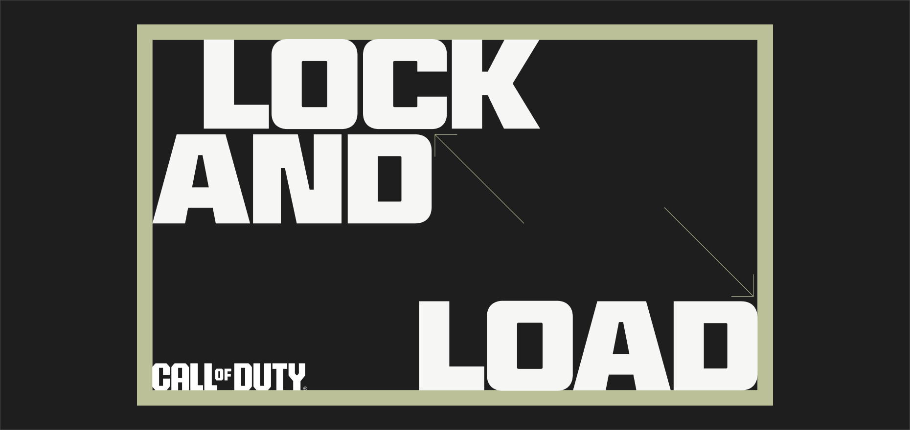
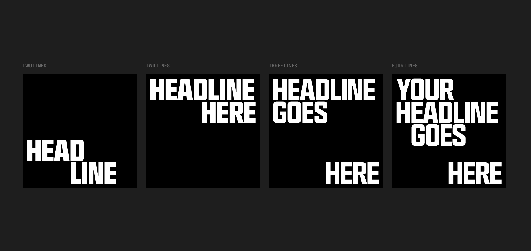
We can split our headlines in different ways depending on the overall composition of the artwork, the size and format of the frame and its margins and the length of the copy lines.
These examples are intended as initial inspiration, the full franchise guidelines will provide more guidance.
WHAT TO AVOID
Here are some examples of what to avoid when setting headline copy within frames using Hitmarker.
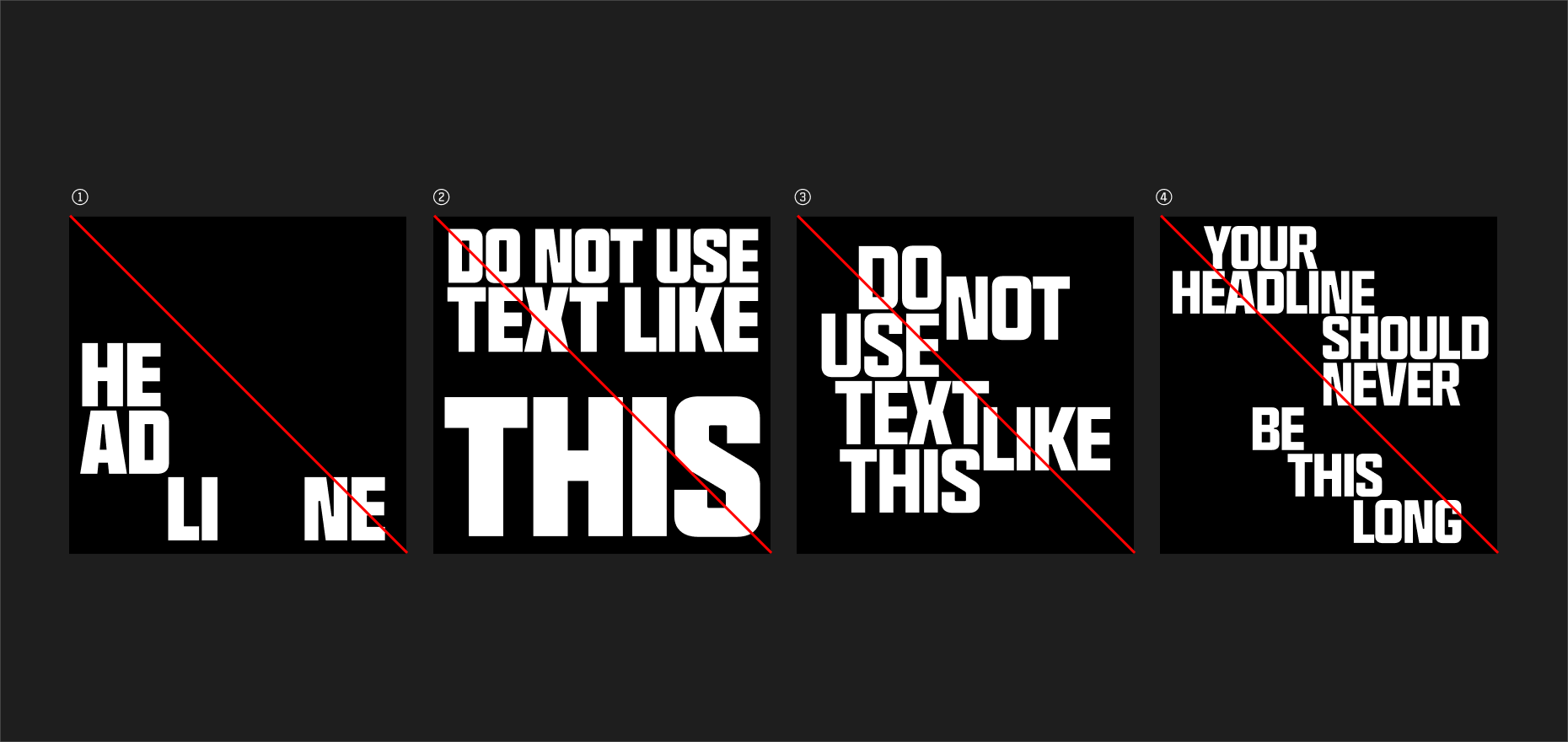
- Avoid splitting individual words that makes legibility an issue.
- Avoid using too many different sizes, weights and widths of Hitmarker.
- Avoid messy and overly complicated alignments.
- Avoid splitting a long copy line too many times.

COMPOSITION
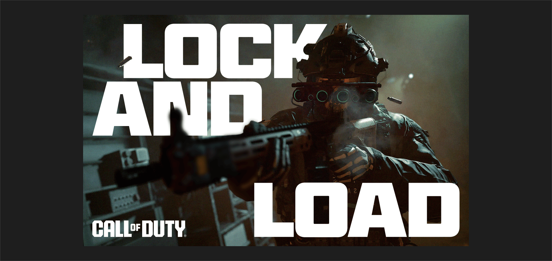
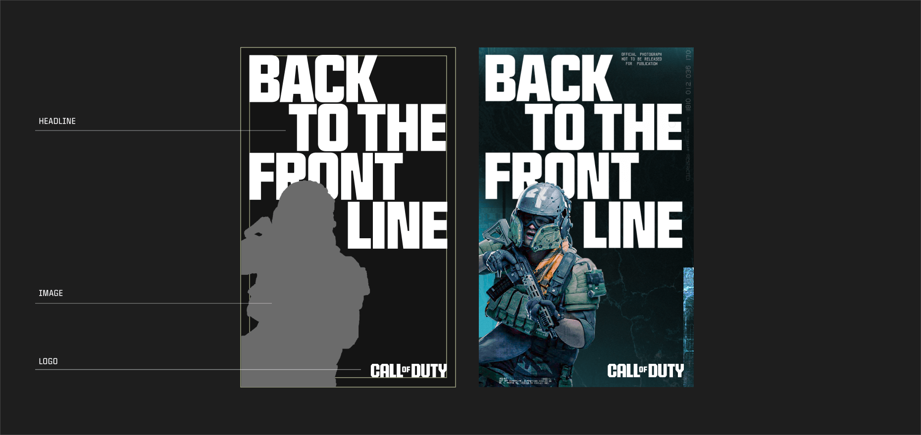
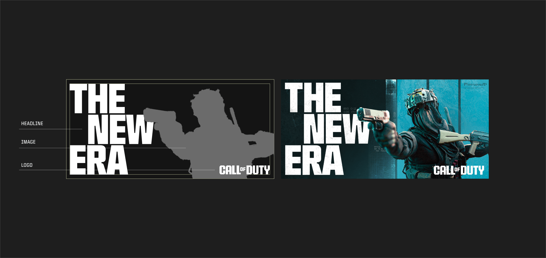
The fourth stage requires positioning our key art within the composition. We aim to create a dynamic yet simple pieces of key art with some overlap between our key art and typography.
WHAT TO AVOID
Here are some examples of what to avoid when setting headline copy within frames using Hitmarker.
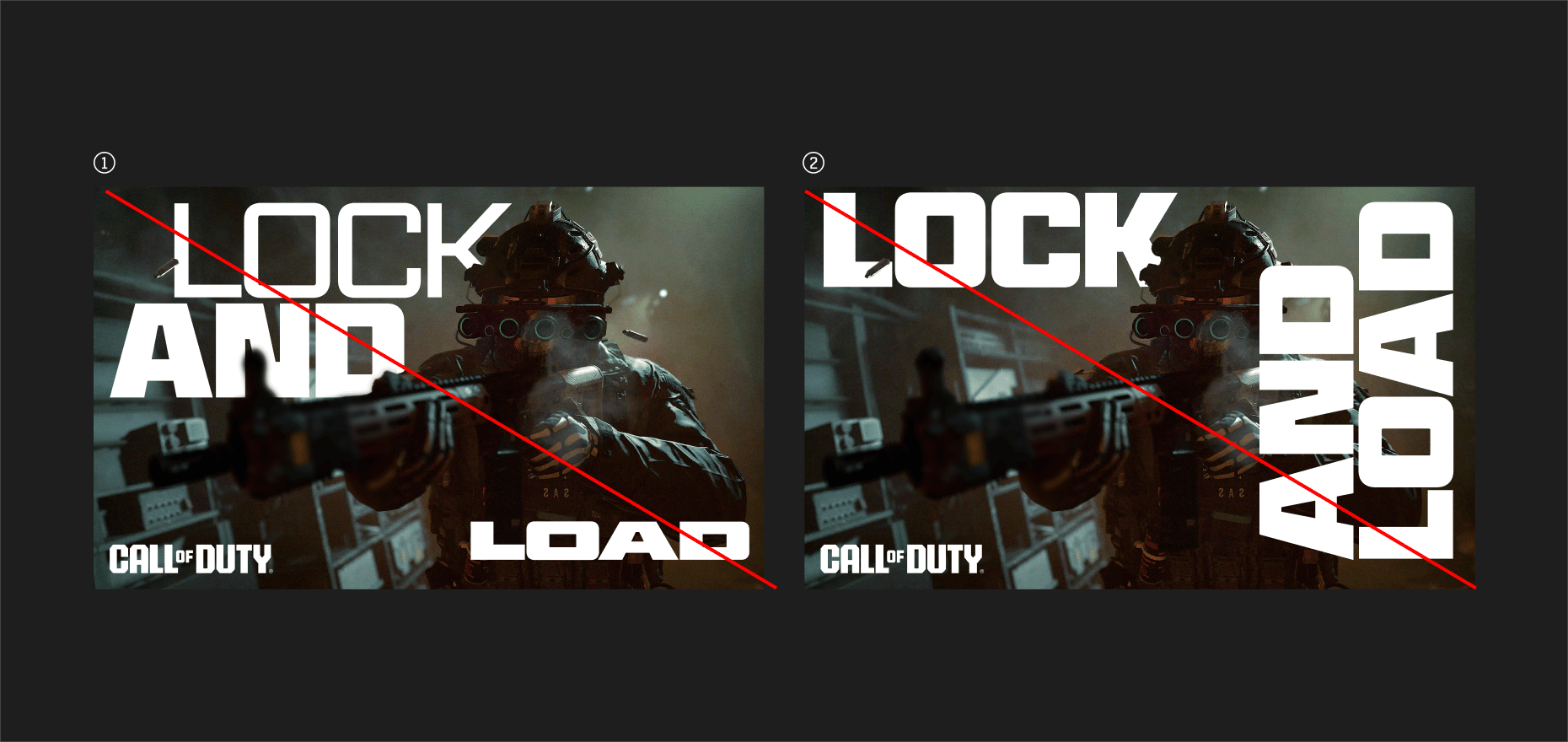
- Avoid using too many different weights, widths and cuts of Hitmarker.
- Avoid alignments that make the flow of the copyline difficult to understand.

DYNAMISM
We can incorporate our typography within the key art to help build a sense of dynamism. Being careful not to limit legibility, we can overlap parts of the key art with the copy line, in most cases, the central character or operator is a good place to start.
WHAT TO AVOID
Here are some examples of what to avoid when setting headline copy within frames using Hitmarker.
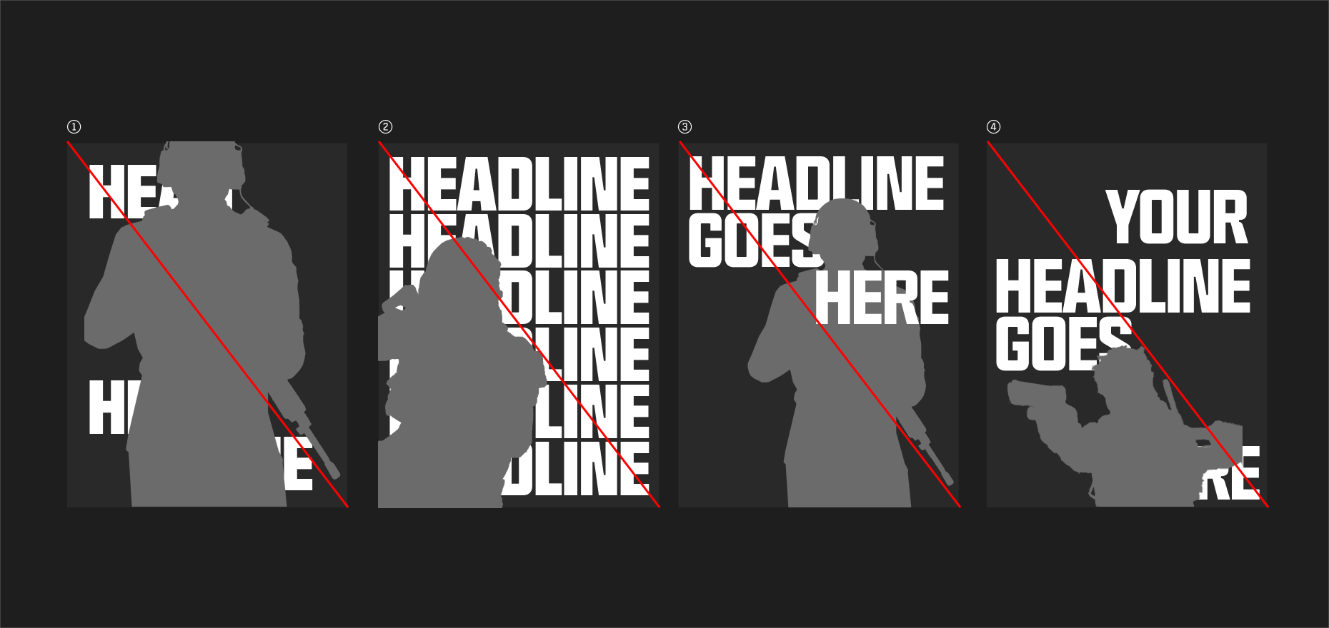
- Avoid completely covering copylines.
- Avoid stacking the copy behind key art as texture or pattern.
- Avoid awkward interactions with copy and operators.
- Avoid overly covering individual words.

COMPOSITION EXAMPLES
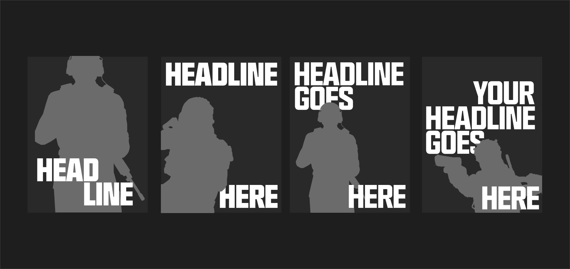
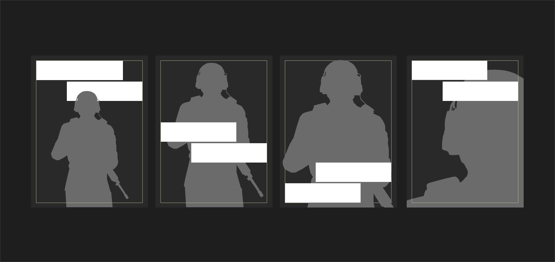
Here are some examples of how to think about composing vertical compositions with Hitmarker, key art and framing.
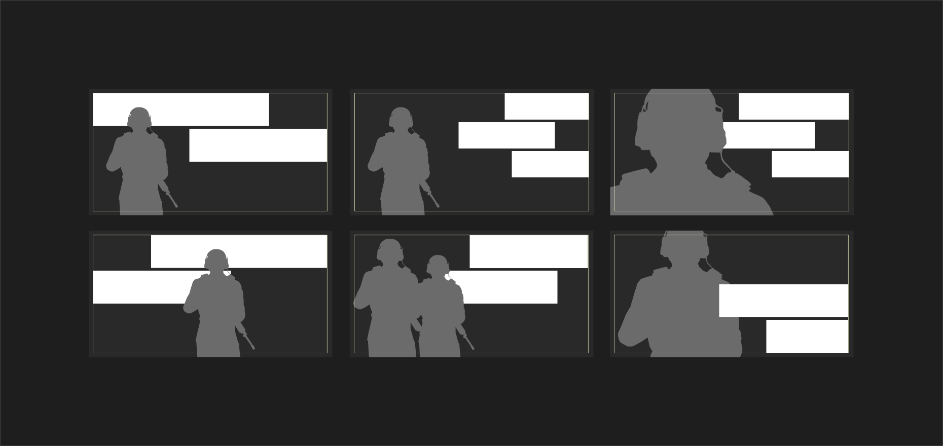
Here are some examples of how to think about composing horizontal compositions with Hitmarker, key art and framing.
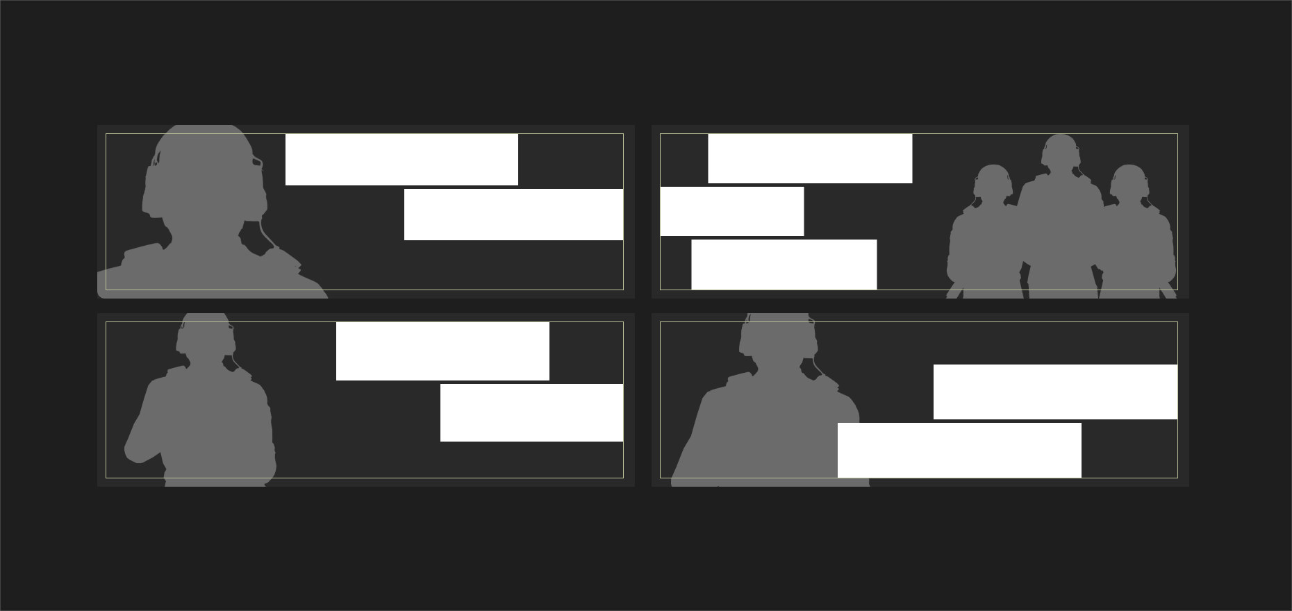
Here are some examples of how to think about composing wider horizontal compositions with Hitmarker, key art and framing.

LONGFORM HIERARCHY
Digital design calls for a variety of different text styles, each with specific purpose. Above are our suggested typographic setting styles to create hierarchy for use in digital, blog, or other longform copy use cases.
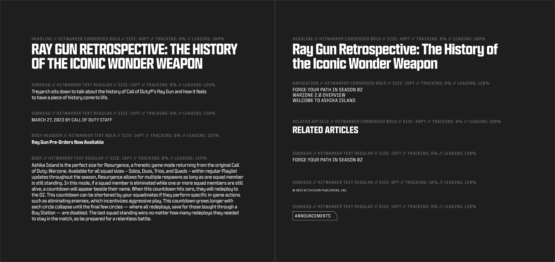
Hierarchy is built into our sizing recommendations, but it’s important to also consider how text is ordered and laid out. Text size and weight can and should be used to denote the most important copy within a design and help guide the eye throughout the specific layout.

MARKETING EXAMPLES
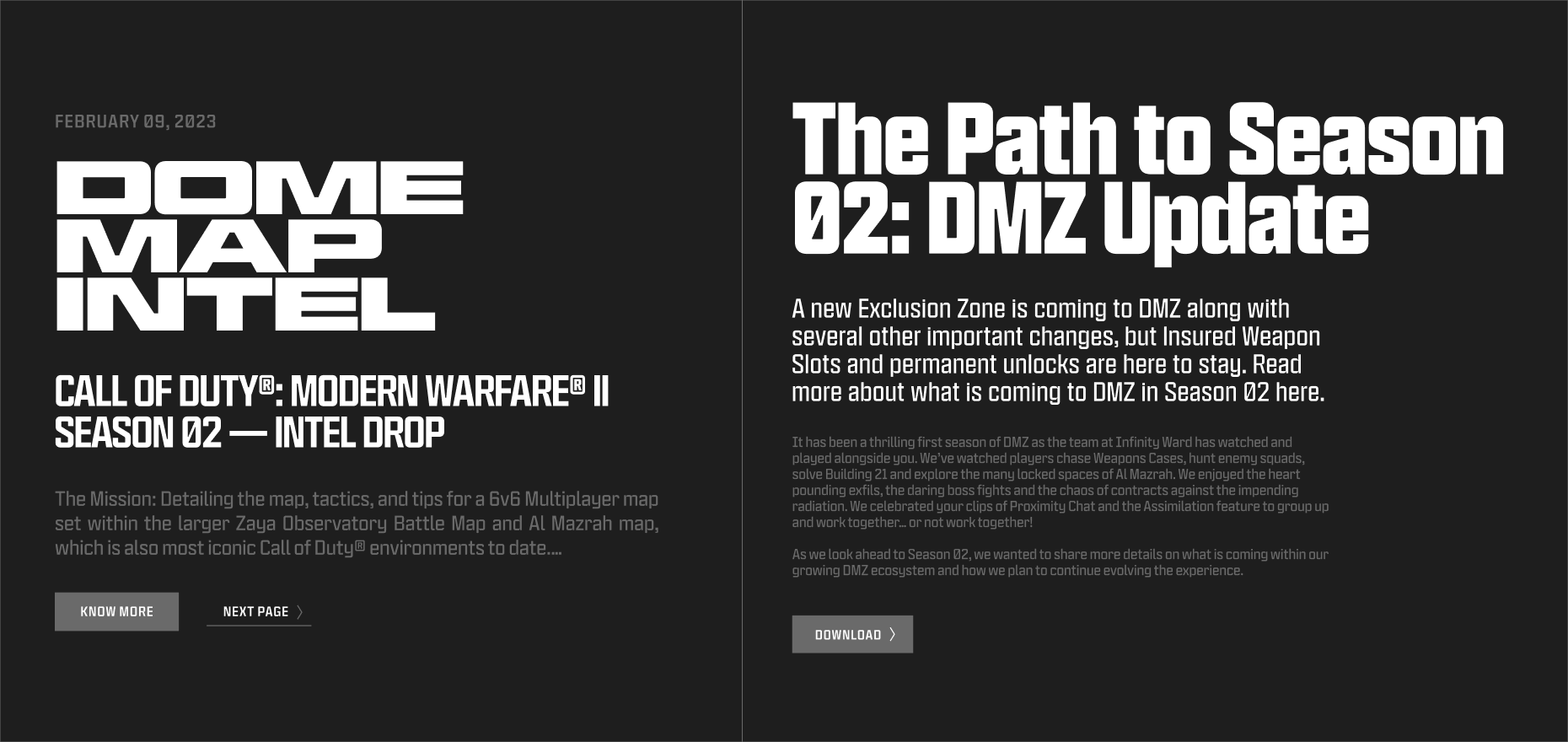
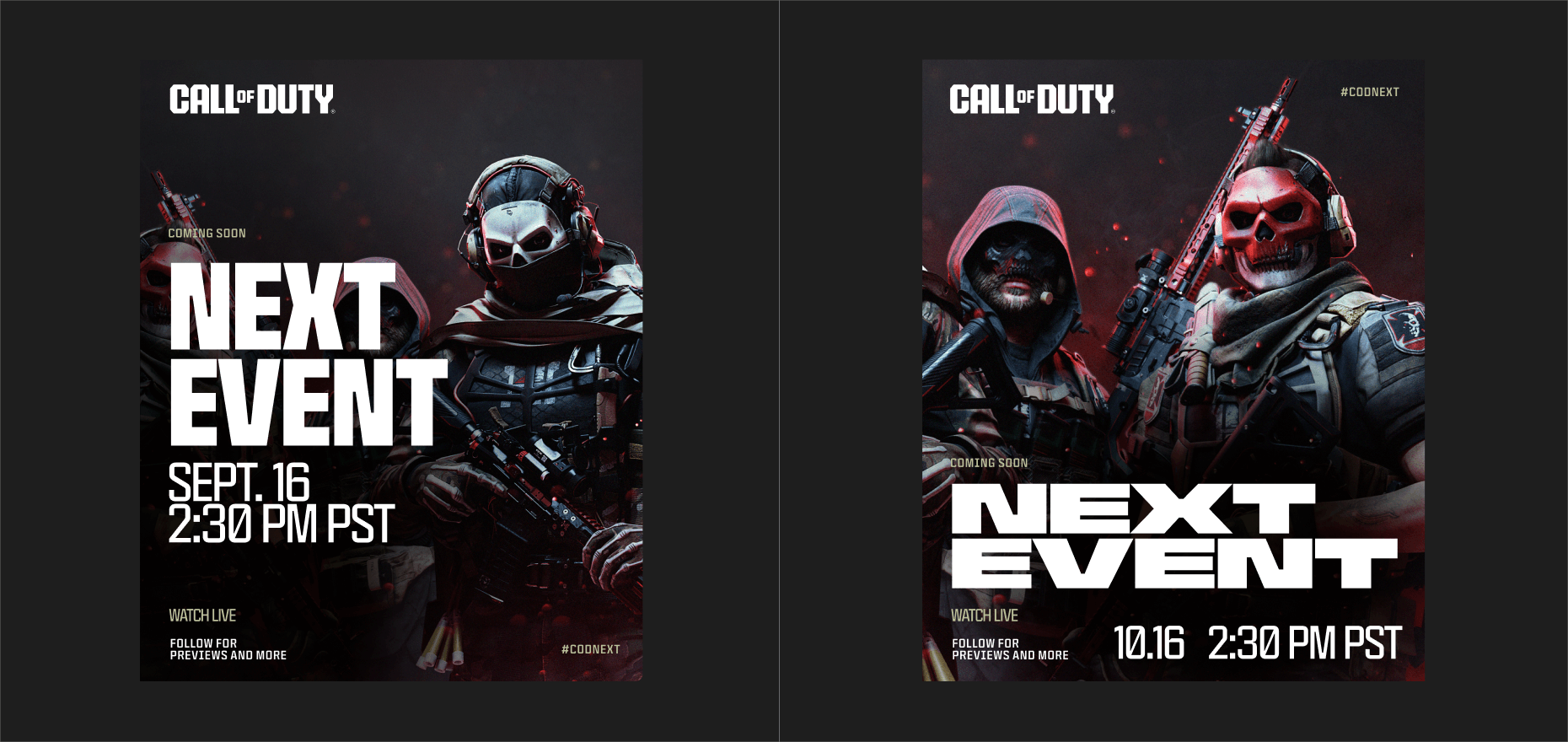
Below are examples of how hierarchy should be used. Scale, weight, and correct use of both headline and text versions of Hitmaker help create layouts that have impact and and intention.

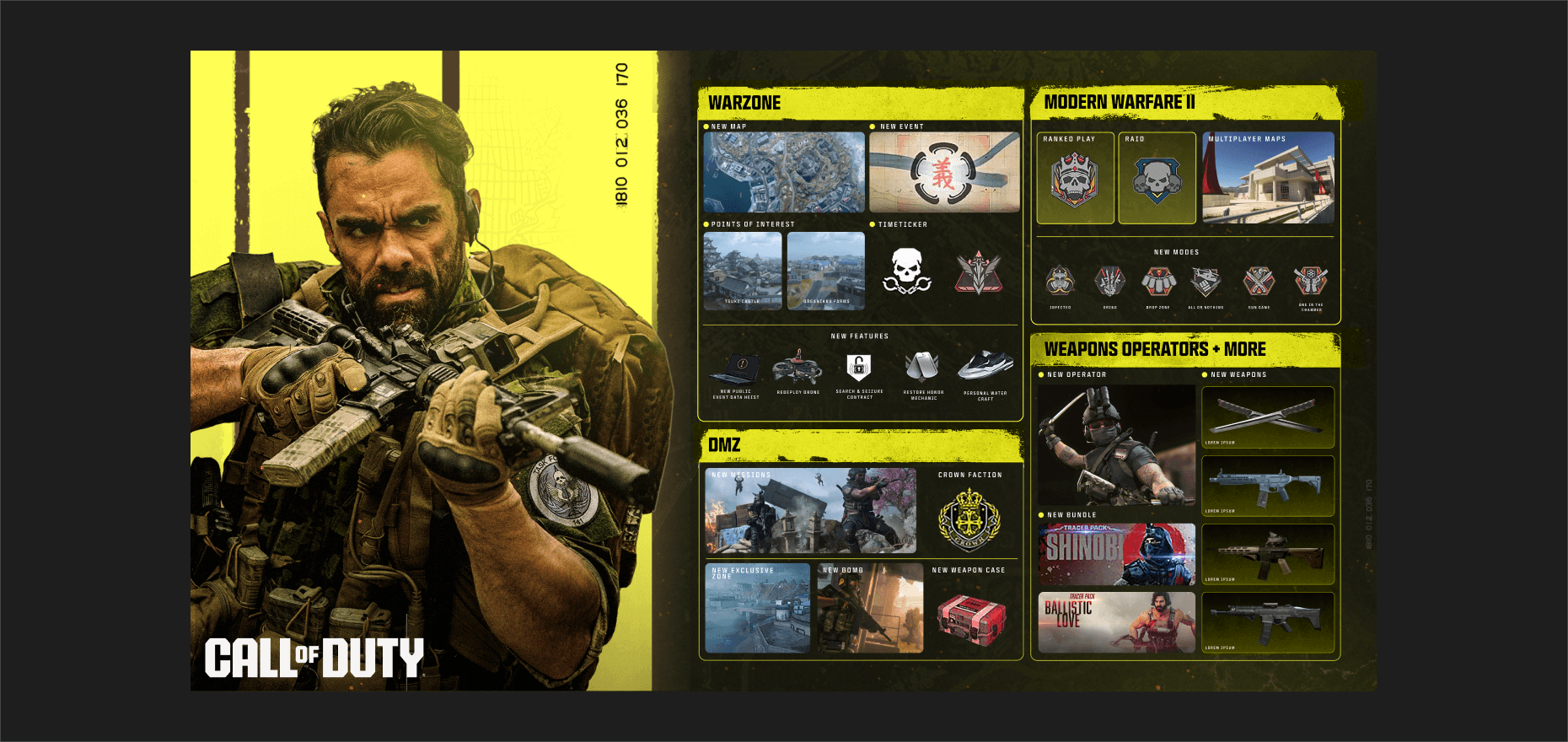
ROADMAP EXAMPLE
Below is an example of how hierarchy should be used. It’s equally, if not more important to consider hierarchy for info dense designs. Scale, weight, and correct use of both headline and text versions of Hitmaker help create a layout that has impact and intention.

BLOG EXAMPLEs
The following examples highlight how hierarchy should be used. Scale, weight, and correct use of both headline and text versions of Hitmaker help create layouts that have impact and intention.

Below is an example of how hierarchy should be used. Scale, weight, and correct use of both headline and text versions of Hitmaker help create a layout that has impact and and intention.
